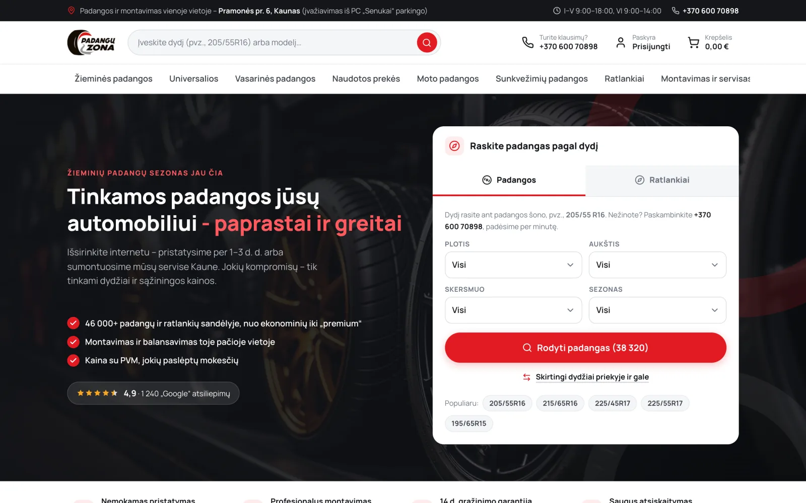
Tyre online store with fitting service booking
Parametric tyre and wheel search, basket, coupons and fitting appointment booking.
A website for solar power systems for homes, businesses and solar parks, with a components store and grant information.
ProblemBuying a solar power system is a long decision with several points where people stop: estimating capacity, grant conditions and financing. The company serves homeowners, businesses, farms and solar park developers at the same time.
SolutionNavigation is organised by buyer type, and grants have their own section with separate conditions for private individuals and businesses. The capacity calculator is placed before the contact form, so people get in touch with a specific need.
A solar power system is not bought on the spot. Between the first idea and the contract, a person estimates the capacity they need, looks into grant conditions, works out financing and judges whether the installer can be trusted. They may stop at any of these steps.
Grants add even more uncertainty. Their conditions and the remaining fund balance change, and buyers often get in touch exactly when they hear about a new funding round.
The company works with several audiences at once: homeowners, businesses, farms and solar park developers. Their questions differ. A homeowner cares about the monthly payment, a farm about the capacity required, a park developer about the technical solutions.
The company also provides servicing and sells energy storage batteries and EV charging stations. All of this had to be arranged so that visitors did not get lost.
The menu is organised by buyer type: systems for homes, for businesses and farms, and for solar parks. Storage batteries, charging stations and servicing are added alongside.
Grants have their own section, with conditions for private individuals and businesses described separately. The grant amount per kilowatt is shown next to them, so visitors can work out their own case without phoning.
The most important tool is the capacity calculator. It answers the most common question: what system capacity is actually needed. The calculator is deliberately placed before the contact form: once visitors have a number, they get in touch with a specific need.
The financing offer is shown as a monthly payment, because that is what homeowners usually compare. A link to the full terms sits next to it.
Customer reviews are shown with names and specific cases. Below them are a gallery of completed installations and answers to the most common doubts about the benefits of a solar system.
Calculator before the form, not after. When visitors get a useful answer straight away, there are fewer enquiries, but they are more precise. A high number of enquiries achieves nothing if half of them lead nowhere.
Grants with separate conditions. Grant rules for private individuals and businesses differ considerably. Combining them into one text would give visitors the wrong expectations.
Several enquiry forms. The forms on the first screen, next to the calculator and next to the grant information pass on different data, so the sales manager sees which topic the visitor was interested in.
Parametric tyre and wheel search, basket, coupons and fitting appointment booking.
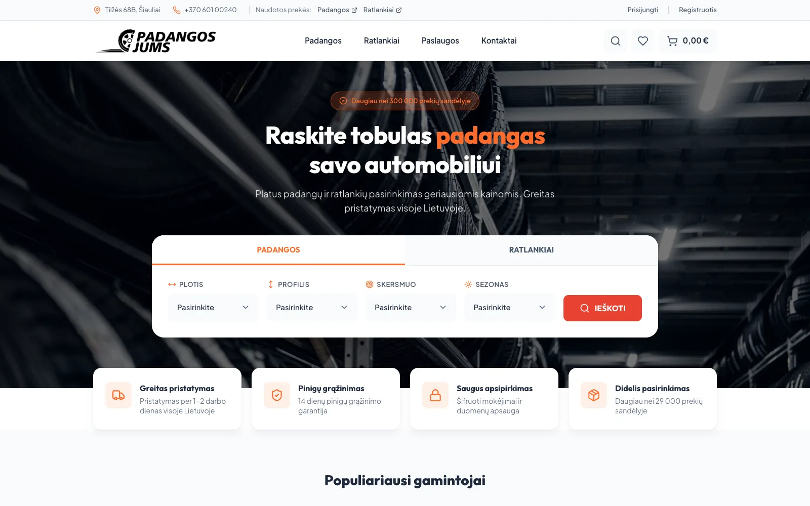
A tyre and wheel store with supplier stock imports, parametric search and product comparison.
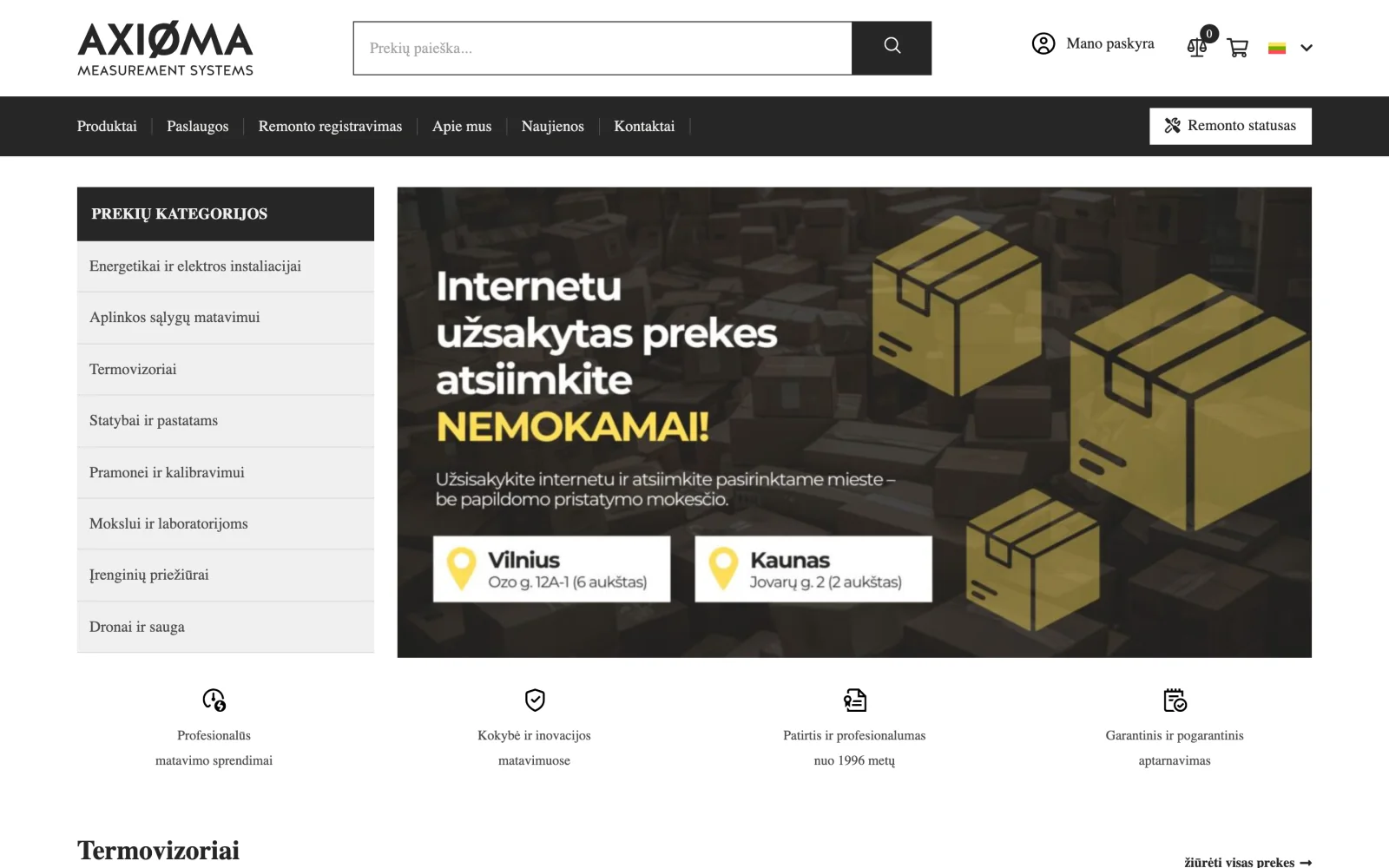
An online store for professional measuring equipment with a catalogue organised by application: construction, industry, laboratories and drones.
Tell us about the process that causes the most friction today. We will come back with questions within one business day.
Or directly: info@desamedia.lt · +370 686 59999