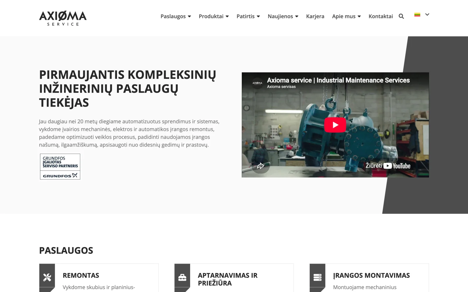
Axioma servisas: industrial engineering services website
A website for an integrated engineering services company, structured by service and by industry for industrial buyers.
A yoga studio website with a class timetable, pricing, gift voucher sales and a blog.
ProblemThe goal of a studio website is booking a specific class, but visitors arrive at different stages: some are choosing their first practice, others just checking for free places tomorrow.
SolutionA weekly timetable with booking in place, without moving to another page. Pricing is presented as three clear options with validity periods, and there are gift vouchers and a visitor account showing the remaining credit balance.
The main goal of a yoga studio website is for the visitor to book a specific class. Everything else is secondary.
The difficulty is that visitors arrive at different stages. One is looking for their first class and does not know how yoga differs from sound therapy. Another already attends the studio and wants to see whether there are free places tomorrow. Yet another is buying a gift voucher.
The studio runs several types of practice, each with its own timetable, duration and number of places. The timetable changes every week, so it cannot live on a simple page that someone edits by hand each week.
Pricing is not simple either. The studio offers single visits, credit packs with a validity period and a monthly membership. These different options had to be presented so that a newcomer understands them in a minute.
Because there are credit packs, visitors need an account where they can see their balance and bookings.
The home page opens with a video of the studio space. This is a deliberate decision: people choose yoga by atmosphere, and one shot of the space says more than a paragraph of text.
The timetable is shown as a weekly grid: you pick a day, and practice types are distinguished by colour. You can book directly in the timetable without leaving for another page. We planned what the visitor sees after a successful booking and what happens if the booking fails, because places are limited and several people may try to book at the same time.
The longer part of class descriptions can be expanded in place. Newcomers need the explanation, but for regular visitors it gets in the way, so the text only appears on click.
Prices are shown as three clear options with validity periods, with the monthly membership set apart. A gift voucher can be bought alongside.
Once logged in, visitors see their credit balance and booking history in their account.
The studio space and the teachers have their own sections with photos, because in yoga people choose a specific teacher.
Booking directly in the timetable. Every extra step between choosing a time and confirming reduces the number of bookings.
Credit validity visible up front. The validity period is a business decision, so buyers must see it before they buy, not find out later.
Video only on the first screen. Further down the page we use photos. More video would slow the website down, and on a phone speed matters more here.
A website for an integrated engineering services company, structured by service and by industry for industrial buyers.
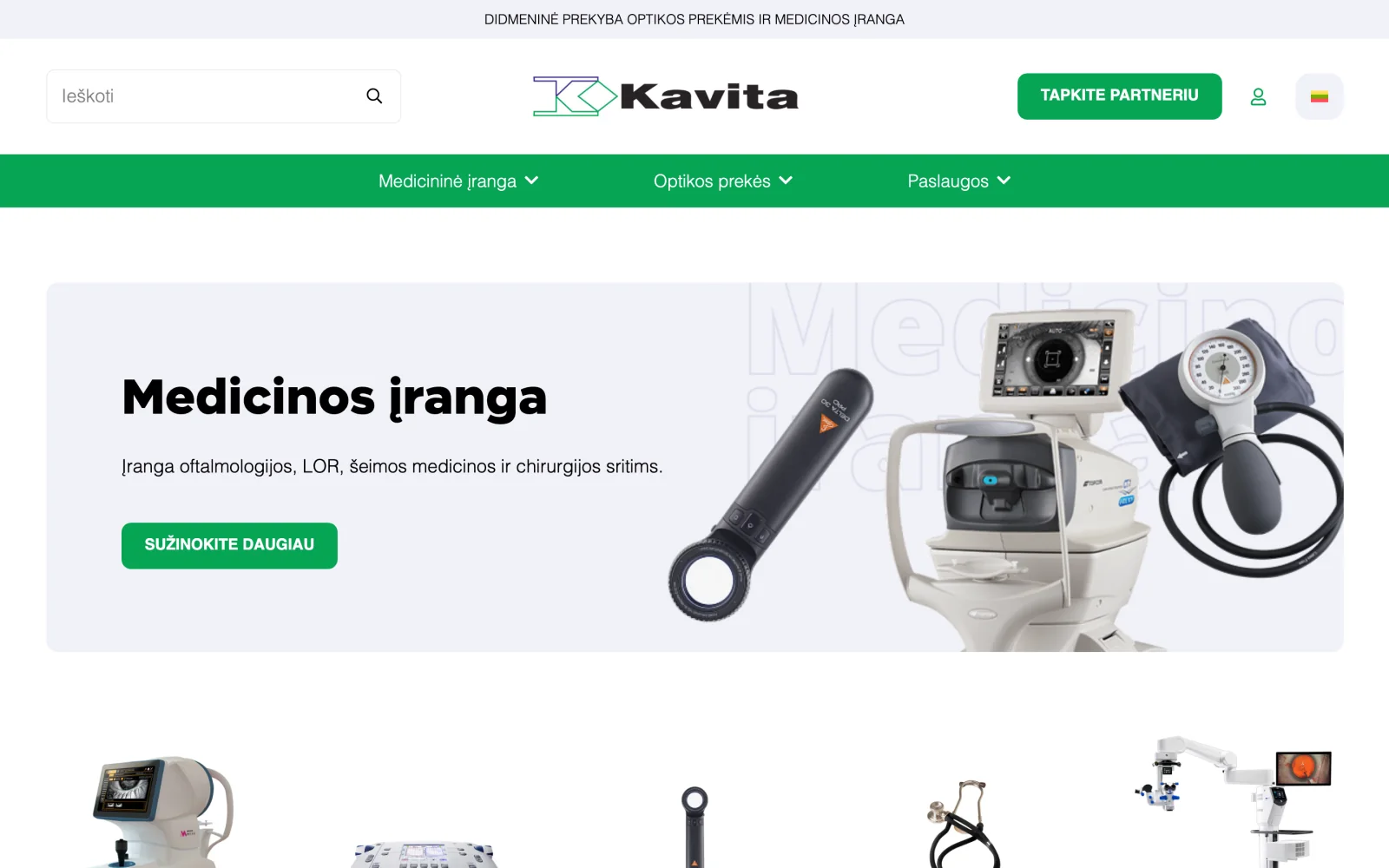
A large medical equipment and optics catalogue organised by specialty, with certificate and servicing information.
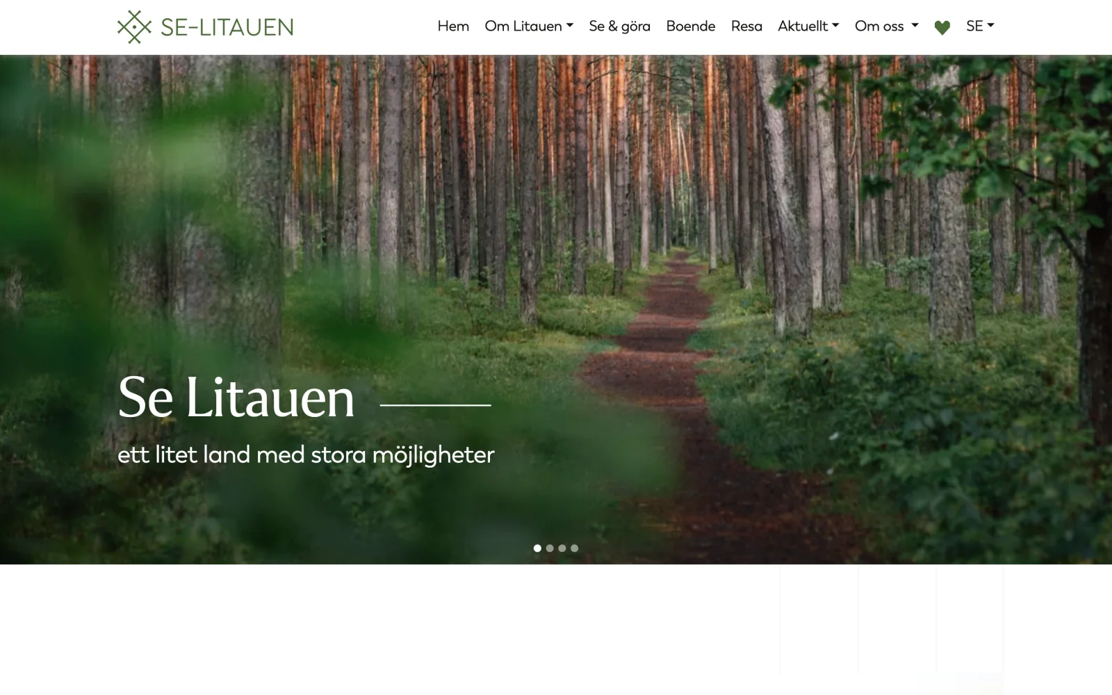
A Swedish-language portal about Lithuania: the country, culture, history, municipalities and trip planning.
Tell us about the process that causes the most friction today. We will come back with questions within one business day.
Or directly: info@desamedia.lt · +370 686 59999